Ever found yourself wondering why some logos simply stick in your mind? You know the ones; basic but unforgettable. The Apple bite; the golden arches; the Nike swoosh. These are visual short cuts for whole brands, not symbols. How therefore can you create a logo that is not only aesthetically pleasing but also truly iconic? Let’s start now.
1. The Brand Whisperer: Know Your Client
We need to know the brand inside out before touching a single pixel. I’m like a brand whisperer. I find its soul. Who does it talk to? What’s its story? What’s different about it?
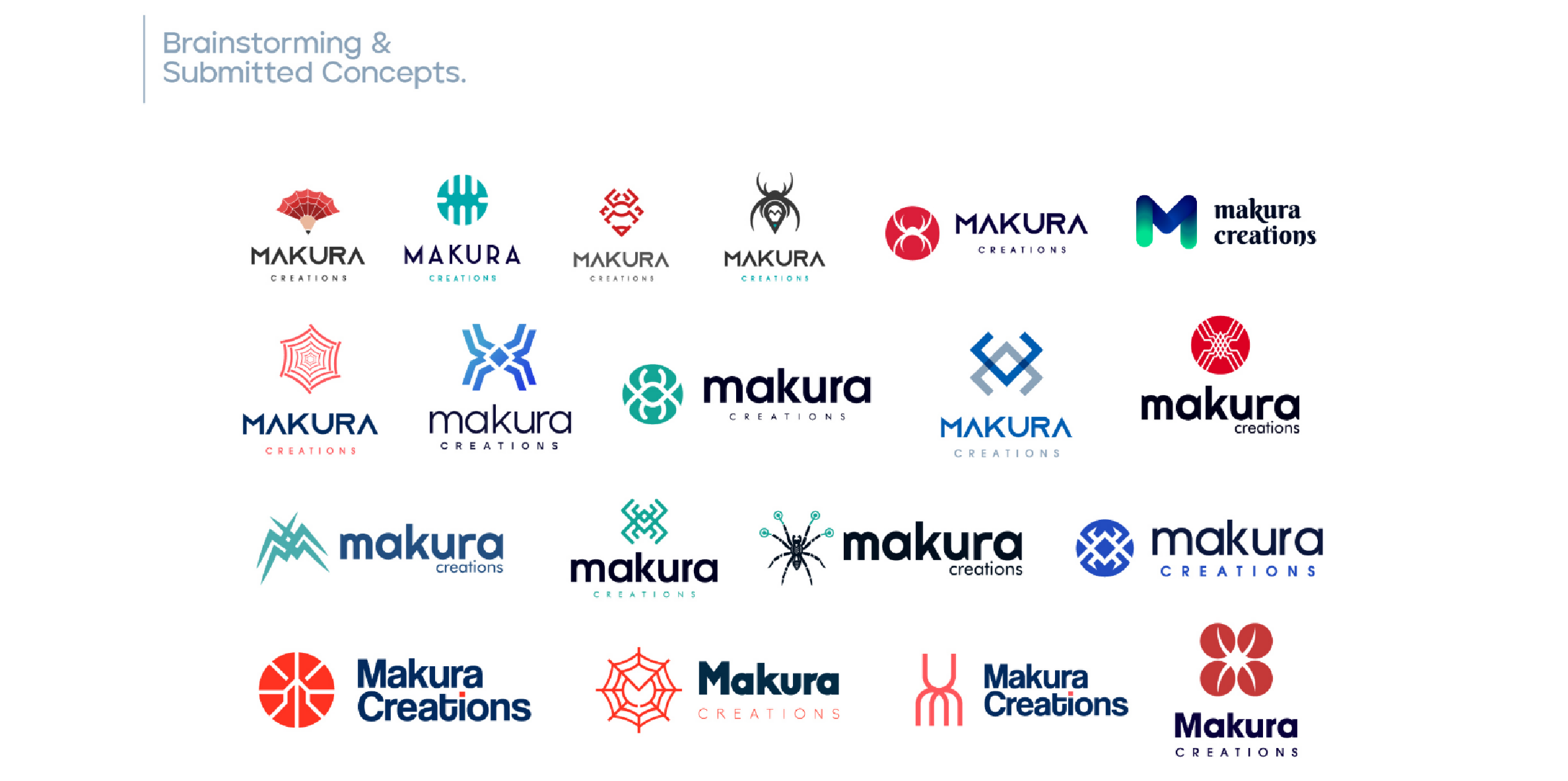
I will research for hours, deep into their values, their competitors, and their target audience. This is not just about gathering facts; it’s about capturing the essence of the brand, its personality. Are they bold and adventurous? Elegant and sophisticated? Fun and playful?
2. The Simplicity Mantra: Less is More
You know that feeling when you see a logo and it just clicks? That’s the power of simplicity. Iconic logos are free of useless details. They are clean, focused, and recognizable at first glance.
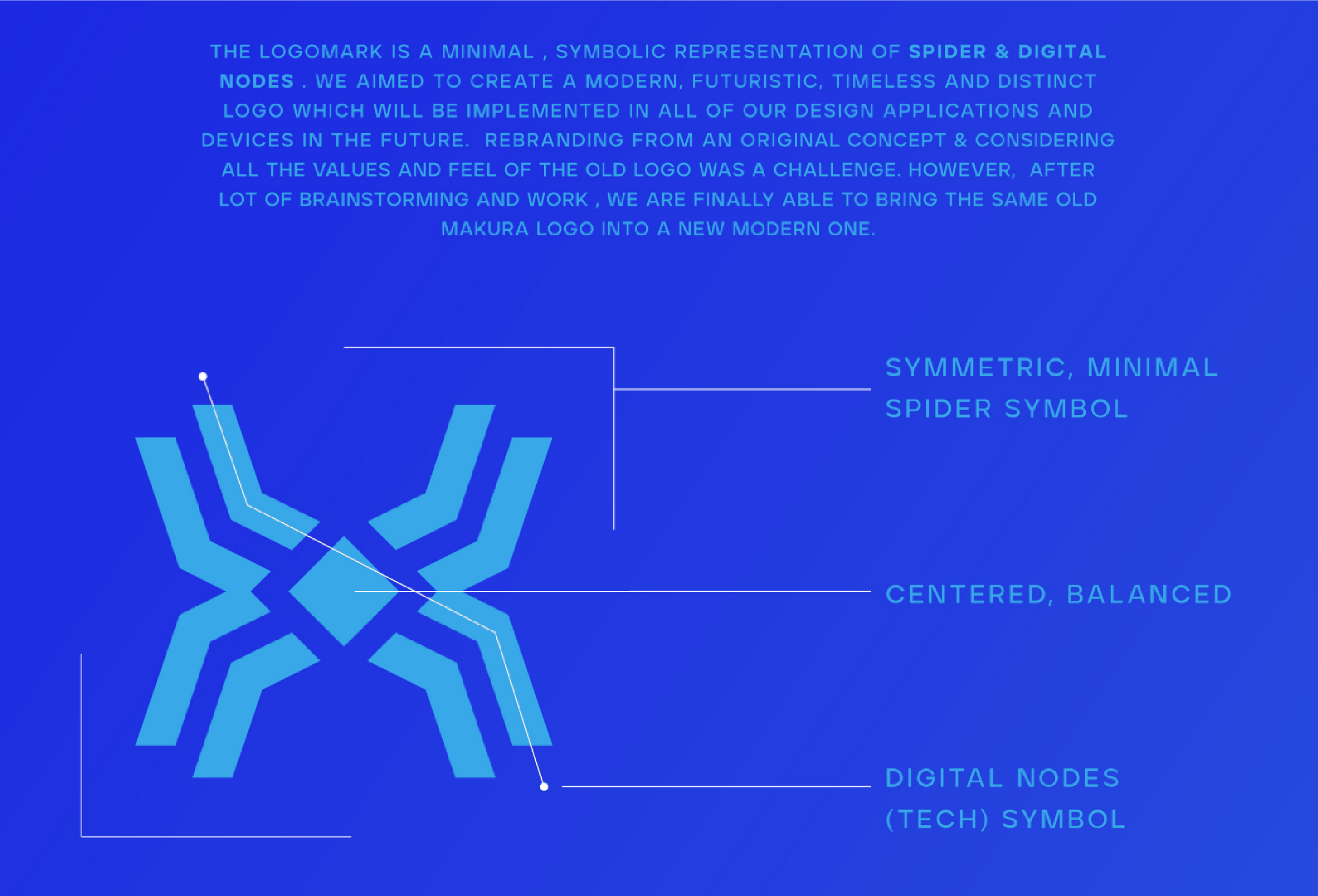
Think of this like the fact that the best stories are often the most concise. You don’t need a novel to get something across. Similarly, with a logo, it should be able to say volumes with a minimum amount of effort.
3. The Versatility Test: Adapting to Any Stage
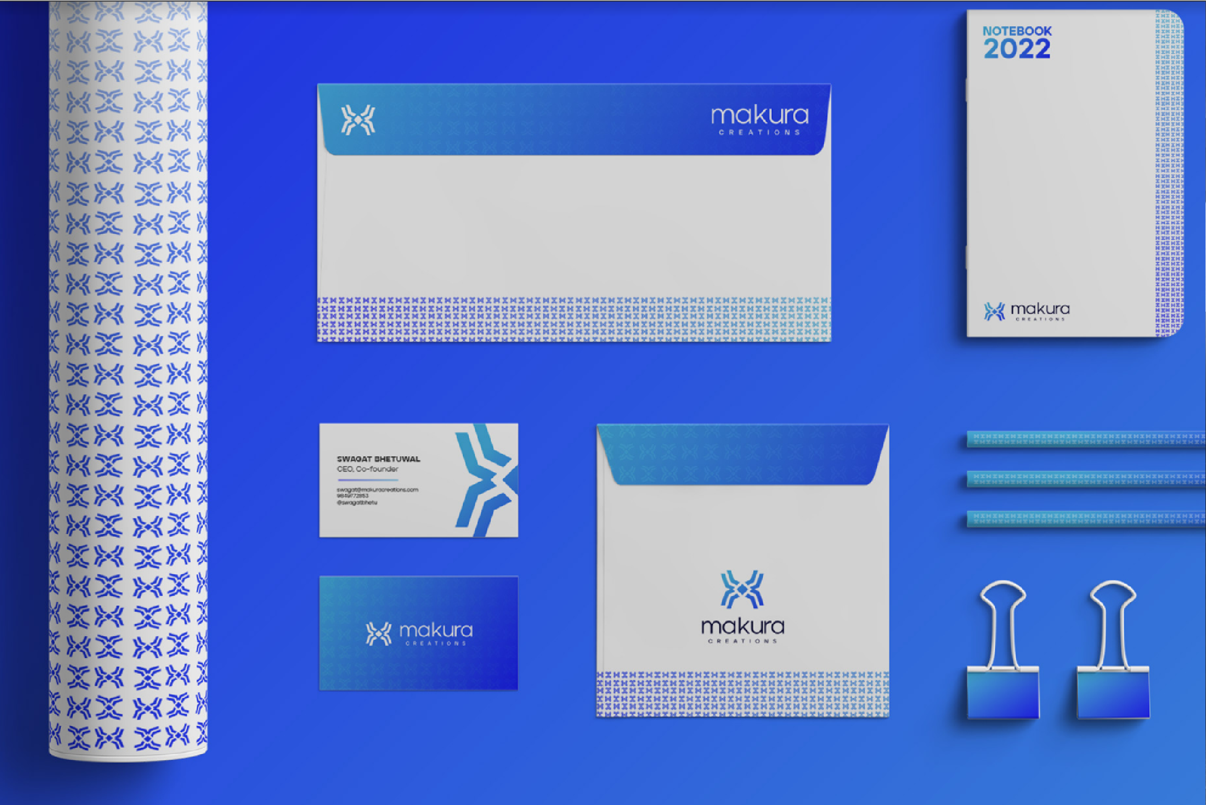
It would mean that the iconic logo should not just be good-looking but an immediate chameleon capable of adapting in several milieus and multiple canvases-from billboards to business cards, from avatars and social media icons to product packing.
It involves size, color, and even negative space: Will it be recognizable when sized down? Does it work effectively in black and white? And such are the thoughts that keep me up late-into the good night!
4. The Memory Maker: Leaving a Lasting Impression
It’s ultimately all about creating an iconic logo that’s gonna leave a mark. About becoming a kind of visual shorthand for the brand-a symbol that creates emotion and resonates with the audience.
Think of it as something like that catchy tune that sticks in your head, which you cannot get rid of. That is what we’re going to try to pull off.
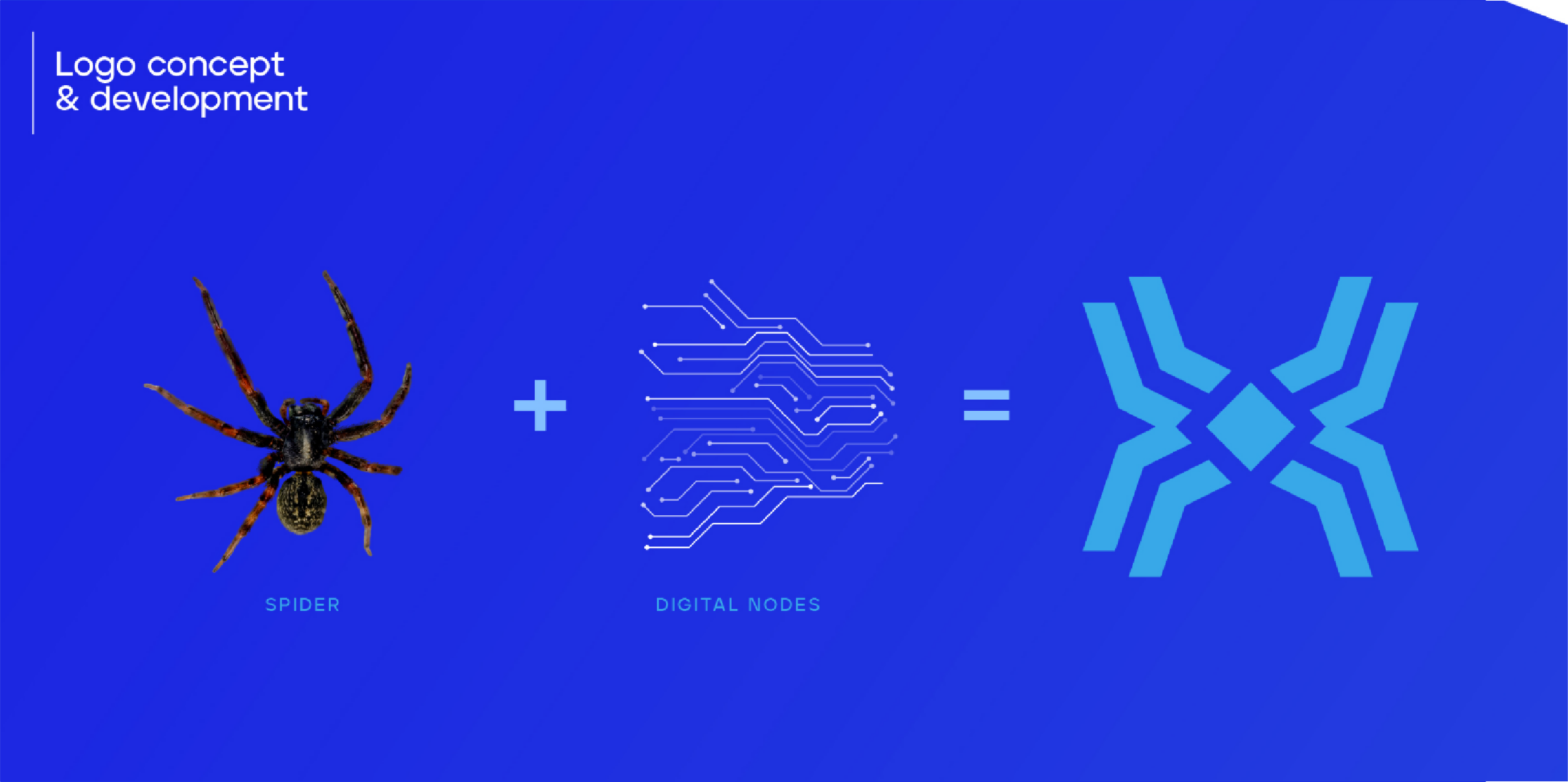
Designing an iconic logo is a journey, not a destination. It’s a journey that takes deep knowledge of the brand, commitment to simplicity, and continuous pursuit of flexibility. But once you’ve crossed that threshold point, when the logo feels perfectly aligned with the brand, it’s a highly rewarding journey.

So, what is your take on this? When is a logo iconic, according to you? Will love hearing that in the comments section below!


