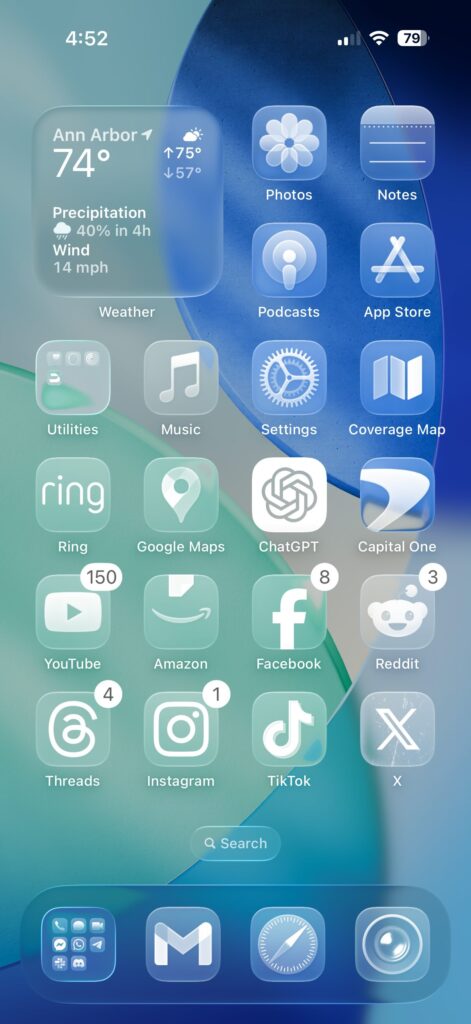
At Makura Creations, we spend a lot of time thinking about how design affects people—not just how it looks, but how it feels to use. That’s why the new iOS 26 update caught our eye. It introduces something Apple calls the “Liquid Glass” look—a bold, glossy, layered design that feels futuristic at first glance.
But when we took a closer look, one question kept coming up: Is it actually better for the user?
Looks Aren’t Everything

The first thing that stood out was the low contrast between foreground elements and the background. Text, icons, buttons—they all seem to blend in just a little too much. For people with perfect vision, it might just feel like a minor inconvenience. But for many others, it directly affects readability and ease of use.
It’s surprising, honestly. Apple usually gets these things right. But this time, it feels like they focused more on “looking cool” than on being easy to use.
We’ve Seen This Before
This reminds us of Microsoft’s Metro UI from years ago. It was clean, minimal, and very different from anything else at the time. But in trying to look modern, it ended up confusing a lot of users. It was too flat, too abstract—and it didn’t stick.
Apple seems to be heading down a similar road. The new look is polished, sure—but at the cost of clarity. It’s harder to tell what’s interactive, and the lack of contrast can make daily use feel like a chore, especially in bright environments.
Design Should Work for Everyone
These days, design isn’t just about visuals. It’s about accessibility, usability, and comfort. A good interface should work just as well for someone with perfect eyesight as it does for someone who needs extra contrast or larger text.
With so many companies investing in design that puts people first—OpenAI being one example—it’s strange to see Apple step away from that direction.
A Gentle Nudge to Apple
Apple has a long history of balancing beauty with function. That’s why so many people love their products. iOS 26 feels like a rare moment where that balance has tipped too far.
We’re not against trying new things. But every bold move should still come back to one simple question: Does this make things better for the user?
At Makura, that’s the lens we use for every design decision. And from that view, iOS 26 feels more like a step sideways than forward.
In Summary
iOS 26’s Liquid Glass design looks great on the surface, but the reduced contrast and less intuitive layout raise real concerns. At Makura Creations, we believe design should always put people first. Innovation is good—but only when it makes things better, not just different.


